Choosing ideas for a winter wedding color palette is one of those decisions that quietly shapes the entire mood of your celebration — from the ceremony florals to the reception table linens and even the bridesmaid dresses. And yet, many couples underestimate just how much creative freedom the cold season actually offers.
Winter is not only about white and silver. Yes, those tones work beautifully — but the season opens a much wider door: deep jewel tones, warm earthy neutrals, moody botanical greens, and unexpected pops of rust or burgundy. The key is understanding how colors interact with winter light, venue interiors, and seasonal textures like velvet, fir branches, and candlelight.
Why winter light changes everything
Natural light in winter is softer and lower on the horizon. In photography terms, this creates a more diffused, golden quality — especially in the late afternoon. This means colors that might look harsh in summer sunlight can appear rich and romantic in a winter setting. Deep navy, forest green, and plum all photograph beautifully during winter ceremonies, gaining depth rather than washing out.
Indoor venues amplify this effect even further. Candlelight, chandeliers, and warm Edison bulbs make warm-toned palettes — think champagne, copper, terracotta — feel genuinely intimate rather than just trendy. Before you commit to a palette, consider your venue’s dominant light source and wall tones, since those will either support or clash with your chosen colors.
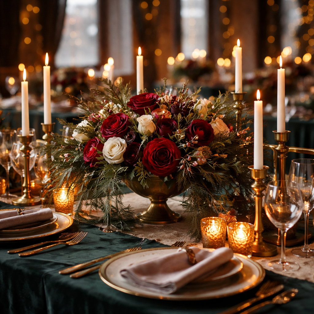
Four distinct directions to consider
Rather than listing dozens of random combinations, it helps to think in terms of mood and direction. Here are four clearly defined aesthetic paths, each with its own logic and palette structure:
| Direction | Core Colors | Best Suited For |
|---|---|---|
| Romantic and ethereal | Blush, ivory, dusty rose, silver | Ballrooms, churches, garden conservatories |
| Moody and dramatic | Deep burgundy, midnight blue, black, gold | Historic venues, castles, industrial lofts |
| Warm and cozy | Burnt orange, terracotta, cream, copper | Barns, lodges, woodland venues |
| Classic winter white | White, ice blue, pearl, platinum | Minimalist spaces, modern hotels, chapels |
These directions are starting points, not rigid rules. Many couples successfully blend two of them — for example, pairing classic white with moody burgundy accents creates a palette that feels both elegant and bold without becoming overwhelming.
Working with seasonal florals and textures
One practical advantage of winter weddings is that certain flowers and greenery are at their most available and affordable. Amaryllis, hellebores, ranunculus, dried pampas grass, eucalyptus, and holly berries all align naturally with a winter color story. When building your palette, it helps to start with what’s actually available florally in your region, then build the textile and decor colors around that foundation.
A florist who specializes in seasonal work will always recommend starting with the flower, not the color swatch. The blooms dictate what’s possible — and in winter, what’s possible is genuinely stunning.
Texture plays an equally important role in winter wedding styling. Velvet ribbon on bouquets, linen table runners, fur stoles, and wooden charger plates all add visual warmth that flat fabric and glossy finishes simply cannot replicate. When your color palette leans cooler — think ice blue or silver — layering in tactile textures prevents the overall look from feeling cold or sterile.
Practical tips before you finalize anything
Before settling on a final combination, there are a few things worth testing in real-world conditions rather than on a screen:
- Order physical fabric swatches and hold them against your venue walls or flooring under actual lighting conditions — not just daylight from a window.
- Ask your florist to create a small sample arrangement with your chosen accent colors so you can see how the blooms interact with the palette.
- Check how your chosen colors look in photographs taken inside the venue, since camera sensors render colors differently than the human eye does.
- Consider your wedding party skin tones when choosing bridesmaid dress colors — not all shades of green or burgundy flatter every complexion equally.
- Think about your stationery early — invitation paper stock, ink colors, and envelope liners should introduce the palette before guests even arrive.
These steps might feel minor, but they prevent the kind of surprises that only reveal themselves on the wedding day itself — when there’s nothing left to adjust.
When to break the “rules” on purpose
Some of the most memorable winter weddings use a single unexpected color to disrupt what would otherwise be a conventional palette. A predominantly white and silver scheme becomes instantly personal when the bride carries a bouquet of deep coral ranunculus. A burgundy and gold palette takes on warmth and personality with a dusty sage bridesmaid option. These intentional breaks prevent a palette from feeling like a mood board lifted directly from a magazine.
The point is not to follow seasonal color trends but to create a palette that reflects the couple’s actual taste, the specific venue, and the kind of atmosphere they want their guests to feel from the moment they walk in. Winter simply provides a remarkably rich visual backdrop — one that rewards couples who take the time to think it through rather than defaulting to the first combination that looks nice on Pinterest.
Where to start if you feel genuinely overwhelmed
Start with one color you love unconditionally — not one you’ve seen everywhere, but one you’d genuinely choose for your own home or wardrobe. That anchor color becomes the foundation. From there, identify one neutral that complements it without competing, and one metallic or accent tone that adds dimension. Three colors handled with intention will always outperform six colors used inconsistently.
If you’re still unsure, bring physical references — fabric samples, paint chips, even torn magazine pages — to your first florist and venue consultation. Professionals in the wedding industry read visual references far better than verbal descriptions, and seeing an actual swatch often unlocks suggestions you wouldn’t have reached on your own.